Election Maps
Written on November 6th, 2020 by Ane Rahbek Vierø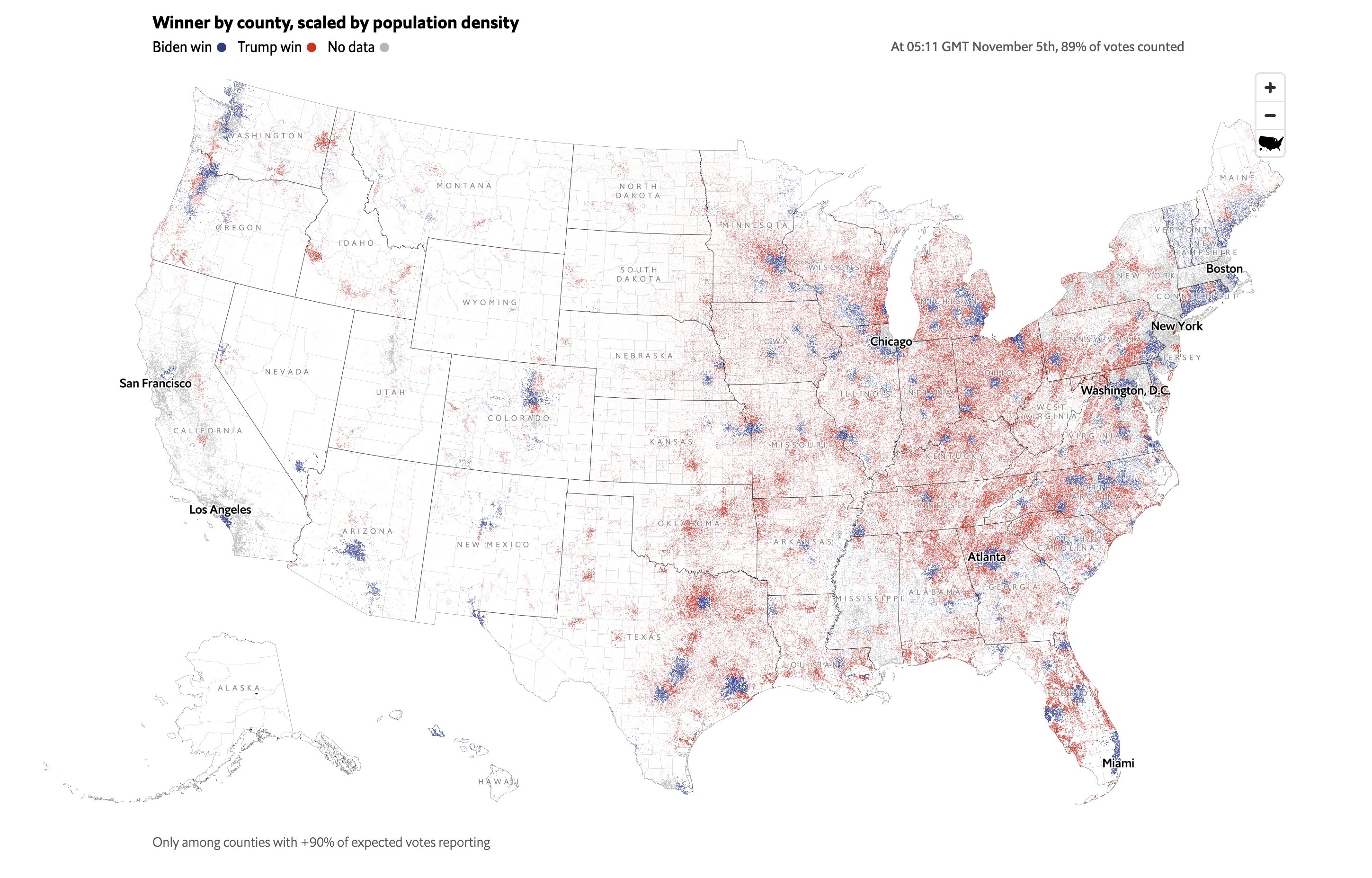
Map by: Martín González
Election Maps
A classic - and maybe one of the oldest? - type of data visualisation is the art of cartography. As with all other data visualisations, data visualised on, or as, maps, can be made to tell very different stories, depending on how you visualise it. For spatial data particularly the choice of geographical scale and unit is an important factor for what story is told.
This is never as clear, as when it comes to the election maps that are used to show how people voted where and which usually are abundant after larger elections.
While one should be careful labelling any map as ‘wrong’ or ‘correct’ (after all a map is always an abstraction and simplification (see for example the old classic ‘How to lie with maps’), specific ways of mapping voting patterns can convey some quite problematic and misleading narratives. Examples are the maps showing voting results per state or geographical extent, resulting in an idea that Trump won a ‘landslide victory’ in 2016 (hint: the population is not evenly distributed so largest geographical extent ≠ most votes).
Similarly, using a very large geographical unit reinforces ideas about homogeneous regions where most, if not all, inhabitants vote and think similarly. This is for example the case in many of the maps used to map the results of the national elections in Denmark:
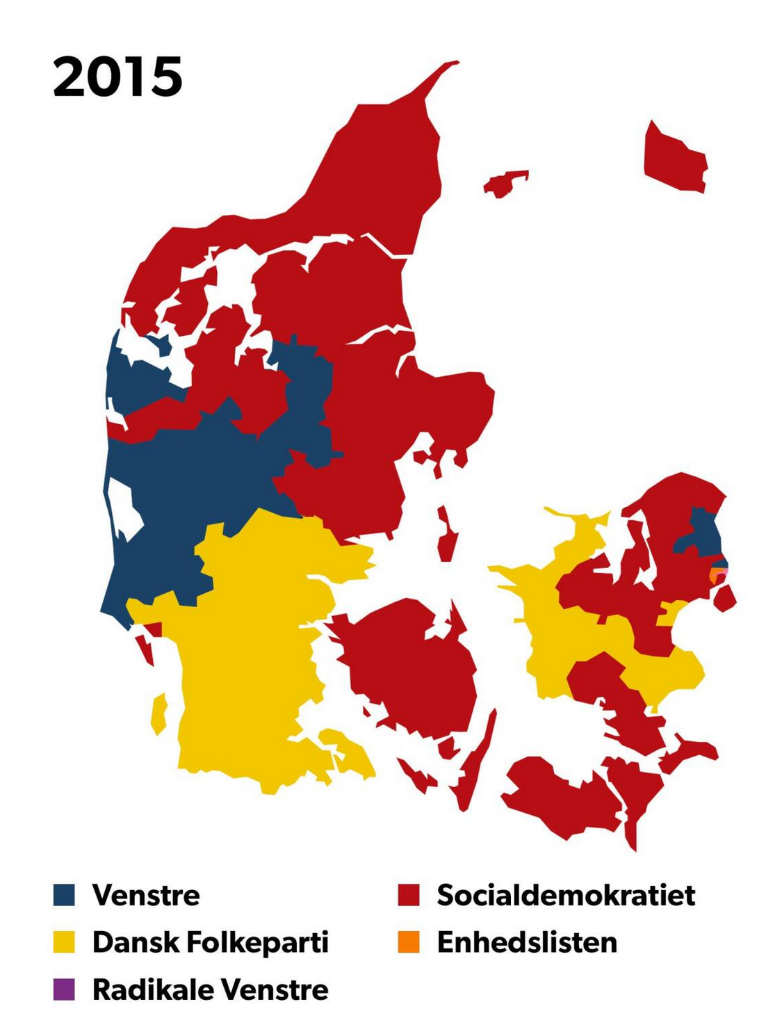 Map of election results in Denmark, visualised for each municipality. Source: dr.dk
In contrast, the map below shows the same data and same election results, but does not to the same extent reinforce the idea of clear-cut urban-rural divides in political affiliation.
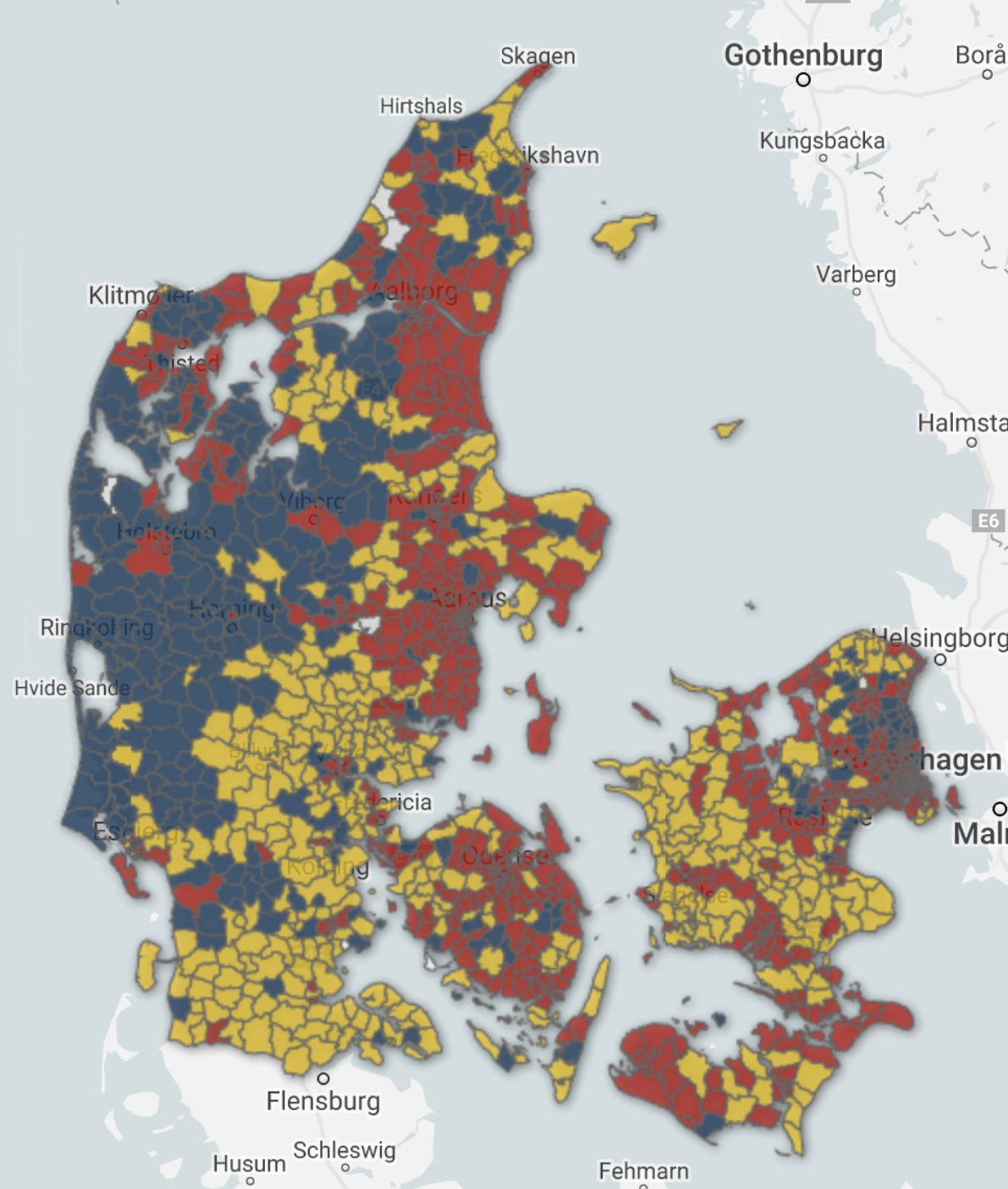 Map of election results in Denmark, visualised for each constituency. Source: dr.dk
As described quite elegantly in this NY-article, there are a number of issues with the traditional way we make maps.
For example, showing election results for geographical areas might give some fairly misleading ideas about who got the most votes, since the population density usually varies quite a bit.
One way of getting around this is to use shades based on population density, but it is hard to communicate exactly how to interpret the relationship between color hue and number of votes. Moreover, most people can only distinguish between 5-7 shades of the same color.
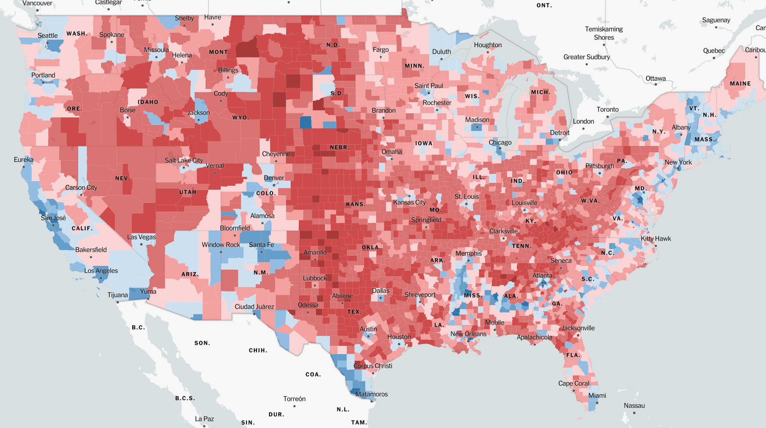 Map of US election results in 2016, using shades to visualize population density. Source: New York Times
To overcome this challenge, some turn to so-called cartograms like the one below (in cartograms the size of each unit is sized in proportion with the data visualized on the map).
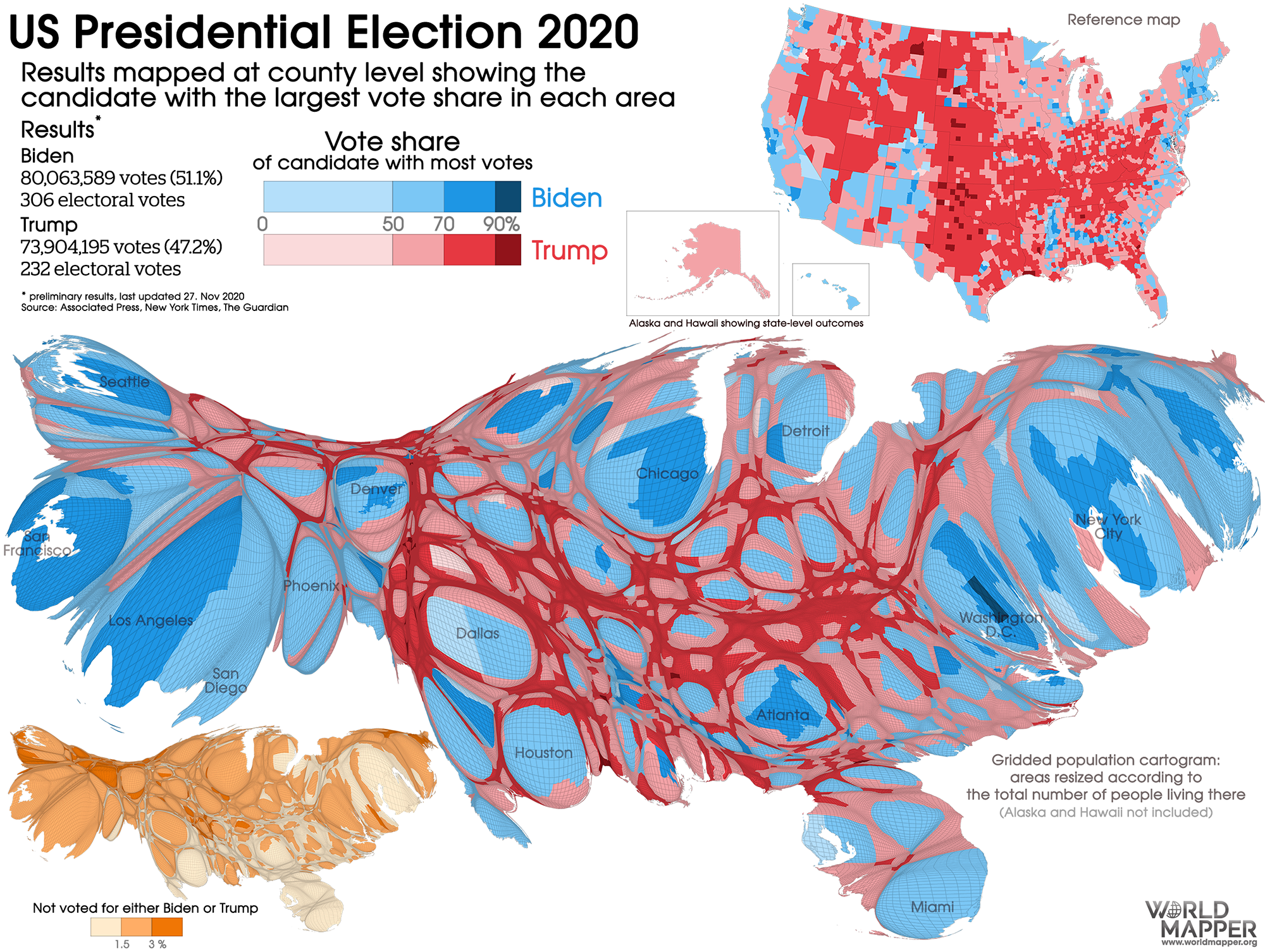 Source: Worldmapper.org
While fun to look at, most people want to be able to locate themselves, or at least their home town in a map, and that is tricky when the map no longer contains the well-known shapes of more common map projections.
The conclusion - maps are difficult to get right! And election maps might be a little bit harder, especially in times of contested results. Below are however a couple of maps which in different ways do a pretty good job at conveying how - and how many - people voted across the country.
 A dasymetric dot density map by Kenneth Field (2016 election).
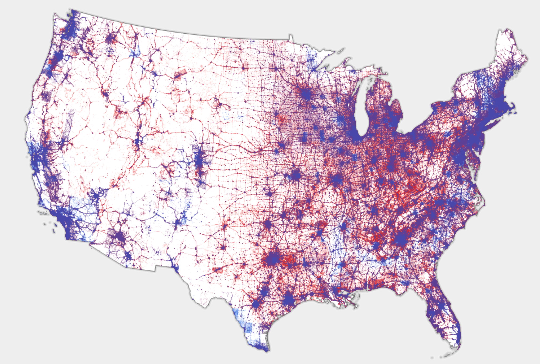
 Election map by Martín González visualizing voting distribution based on both building footprint and population density (2020 election).
P.S. Election maps, or rather, election results and how people vote in different places, can often tell us a lot about a country’s history and demography. For an interesting example of this, check out this twitter thread by Latif Nasser.